All projects
SaaS · Customer support software
Relay
Shared inbox for support teams · landing page
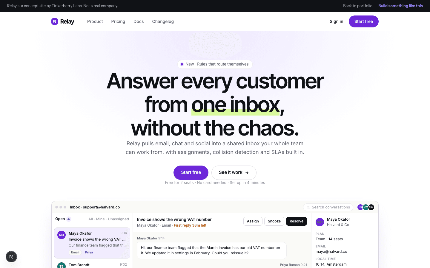
The classic B2B SaaS landing page done properly: a product mock you can actually click through, features shown as working vignettes, and pricing that recalculates when you switch to annual.
The brief
What it had to do.
Most SaaS pages show a screenshot and hope. The brief was a page where the product is demonstrated in the hero itself, and where every section answers a buyer's next question in order.
Design approach
The decisions behind it.
- White ground, tight grotesque headings, one violet accent and one lime highlight
- A three-pane support inbox built in HTML rather than pasted in as an image
- Pricing, how it works and FAQ in the order a buyer actually asks
Signature interaction
Product mock you can click through, and pricing that recalculates
Clicking a conversation in the hero mock swaps the thread and the customer sidebar, and Resolve marks it done in the list. The pricing toggle recalculates every tier for annual billing.
On a phone
Usable before anything loads.
The product mock collapses to a single pane on phones and the pricing tiers stack.
Next.jsHTML product mockCSS Modules